RBC Wealth Management
(tl;dr)
Full case study is password protected.
Enter the password to view the full case study, or email me if you'd like to chat!
Opened the full case study in a new tab.
Your browser blocked the pop-up, open it on Figma instead.
Mission
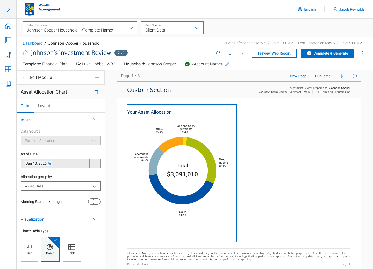
Consolidated 6 legacy applications into a unified document builder for investment advisors, focusing on streamlining complex workflows and introducing modern, high-value features. The goal was to redesign the existing designs we inherited from a third-party designer.
New core capabilities
- In-line editing: Introduced direct, in-platform editing to eliminate external workarounds.
- Bulk exporting: Implemented batch generation and exporting to reduce manual processing.
The problem
The legacy experience was hindered by severe context switching. Advisors had to pull data from siloed applications and repeatedly execute the same redundant document creation flows from scratch, making the reporting process incredibly tedious and inefficient.
Design research
I synthesized findings from 10 user interviews conducted by our UX Researcher, conducted usability testing on legacy designs received from a third-party designer, and analyzed top market competitors.
Analyzing user interviews
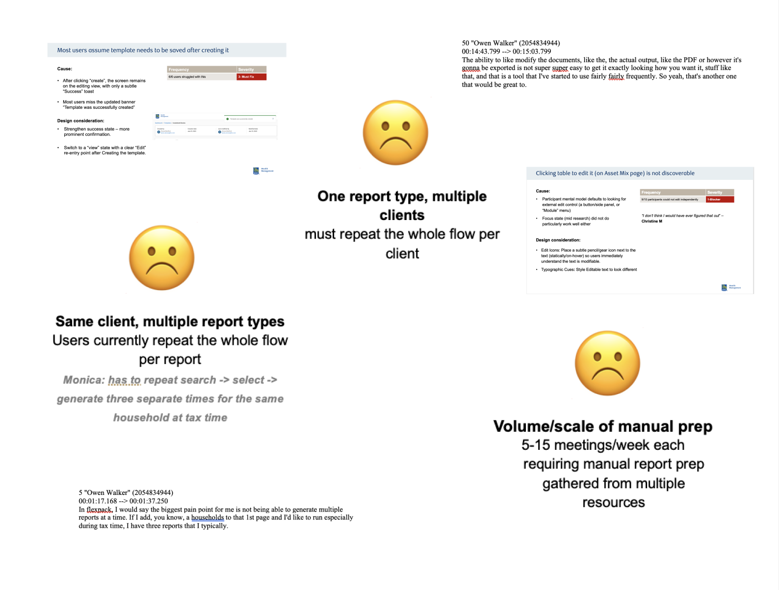
- 10/10 expressed that the biggest pain point was the inability to batch-generate multiple reports for household accounts at once.
- 9 of 10 participants could not edit table data independently.
- 10/10 users expected a template to automatically save upon creation.
Competitor research
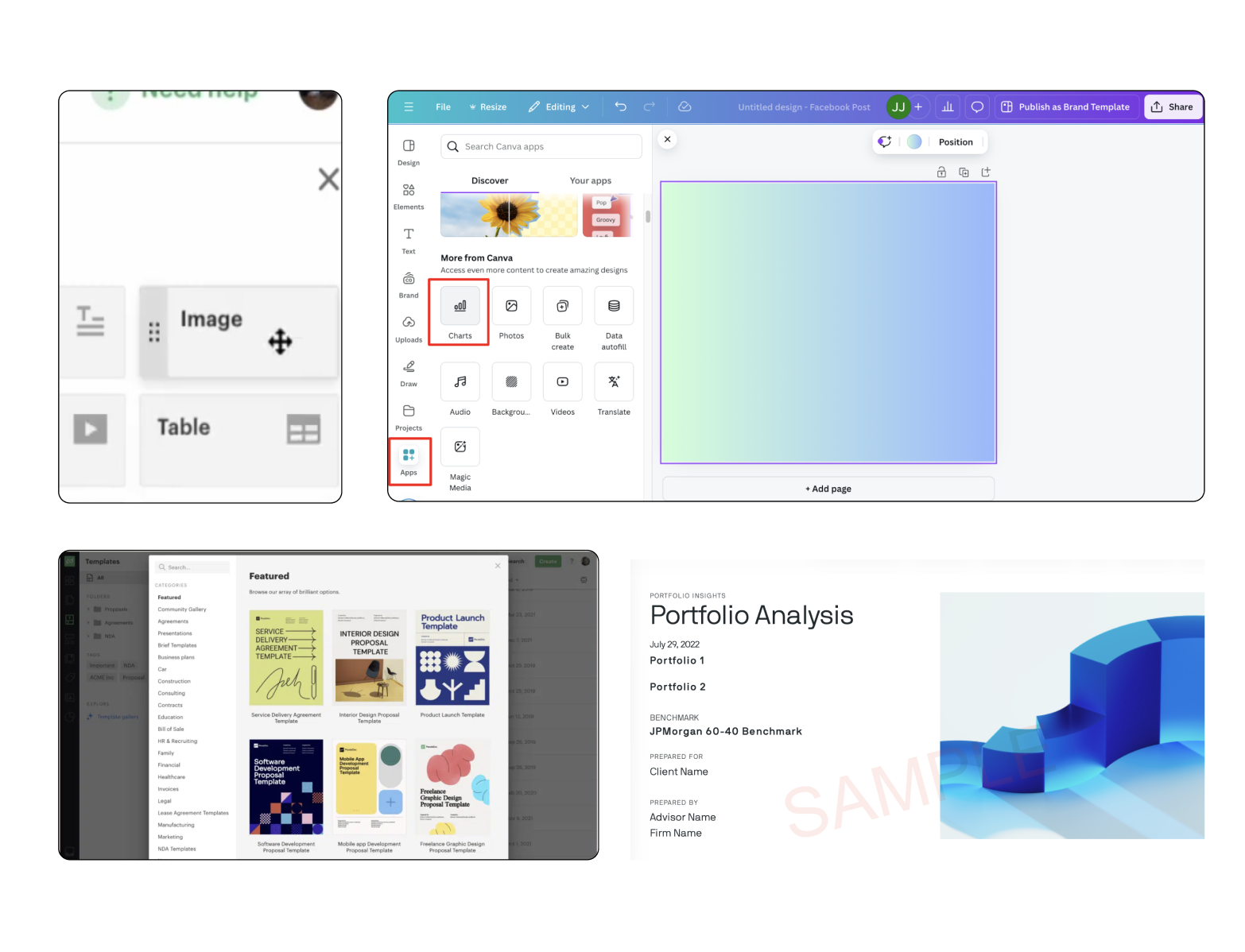
I benchmarked top-tier document builder applications to identify best-in-class UI patterns and address critical pain points discovered during user interviews. Key findings included:
- Thumbnail navigation The pain pointUsers struggled with heavy cognitive load and excessive scrolling when trying to scan or navigate long documents. The solutionImplemented a persistent left-hand page viewer providing visual thumbnails, enabling quick structural scanning, reordering, and direct page jumping without endless scrolling.
- Clean UI & content hierarchy The pain pointUsers experienced cognitive overload due to cluttered layouts and excessive text density on a single screen. The solutionAdopted a clean, streamlined UI with intentional whitespace and progressive disclosure to reduce visual clutter and keep focus strictly on the active task.
User journey
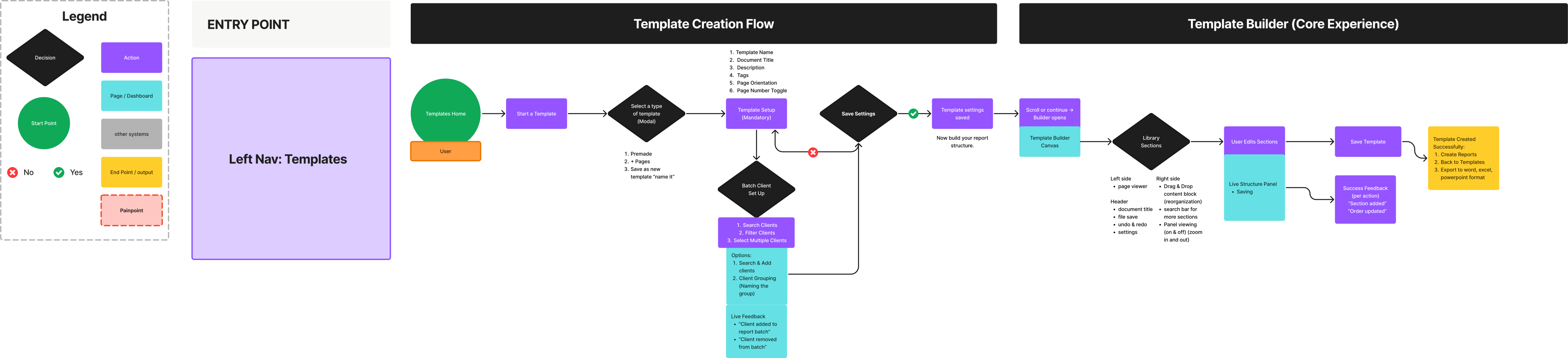
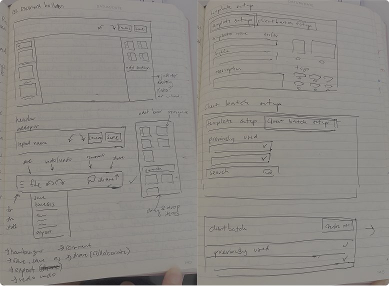
I made a revised user journey and low-fidelity sketches to share with the senior product designer and product designer on our team.
My primary focus was translating the critical user research findings directly into actionable structural solutions specifically targeting the pain points around manual context-switching, table editing, and reporting efficiency.
Due to a strict project timeline, formal user testing at the low-fidelity stage was skipped. Instead, I relied on rapid internal critique loops with the product designer and senior product designer to validate the user journeys before moving forward.
Document builder redesign
Solution
I presented a full case study to the director of design and senior manager, including a journey for three different use cases.

Key changes
- I shifted from screen-based to journey-driven design. Breaking down each micro-step within the user flow exposed hidden friction points, like static tables and manual saving, and allowed for a more cohesive, end-to-end experience.
- I focused on 3 different journeys for batch report generation: creating a new template from scratch, creating a new client batch, and bulk creation.
Like what you see? Email me to see the full case study!
Testimony

Sophia was an incredible asset to our team this summer.
She consistently demonstrated initiative, grit, and a genuine eagerness to learn, always asking thoughtful questions, seeking new opportunities to contribute, and offering a helping hand wherever needed. She took ownership of her responsibilities, and knew when to seek guidance to continue growing.
One of the things I admired most was her willingness to step outside her comfort zone. Throughout the summer, she made significant progress in her public speaking and presentation skills, eventually booking her own stakeholder meetings and facilitating roundtable discussions to share her work and gather feedback. She also made a conscious effort to build relationships across the organization through coffee chats and connections with fellow summer students.
From the beginning of her term, Sophia set clear goals for herself and successfully achieved them by the end of the summer. Her dedication, curiosity, and commitment to continuous growth made her a pleasure to work with, and I am confident she will bring the same enthusiasm and determination to her future endeavours.